.svg)
AI
Webless — A new identity, a clearer story, and a website built to match the product
We’ve seen a significant boost in visitor engagement, with users spending more time exploring our content and interacting with key sections of the site. The feedback from customers and prospects has been overwhelmingly positive—many have specifically called out how polished, intuitive, and engaging the experience feels.

Suyog Deshpande
CEO, Webless AI
When Suyog, co-founder of Webless, first reached out, he described the situation very plainly:
“Our product is strong, but the site gives people no idea what it can actually do.”
Webless builds generative AI search for large websites. It reads huge amounts of content and returns direct answers in seconds. The technology is impressive. The website, at the time, wasn’t. Visitors struggled to understand the idea, the visuals didn’t support the story, and the brand didn’t feel like something built for an AI company. The team needed a site that made sense to new users without lengthy explanations.
Where the work began
The first conversations with Suyog moved quickly. He had clear thoughts about the audience and what wasn’t landing. That helped us step straight into mapping the information architecture and figuring out how the story should unfold. Content structure came into focus early, and it gave us a direction for the visuals.
During this phase, another gap became obvious: the brand didn’t have the strength to carry the new narrative. The identity needed more presence and a visual point of view that actually reflected the nature of the product.
Redesigning the brand and story
We rebuilt the brand from scratch. Updated logo. Clearer type. A stronger colour palette that suited an AI-first company. One of the concepts paired an infinity form with a search icon. It captured the idea neatly: a system that can pull answers from deep, varied content without losing context. That became the final mark.
With a stronger identity in place, we shaped the core narrative. The earlier site forced people to guess how the product worked. The new structure walks them through the idea step by step: what Webless does, where it fits, and why it matters.
Designing and animating the experience
Once the content structure was set, we moved into design without waiting for every word. The foundation was clear enough to start shaping the page flow.
As soon as we explored the product story, it became obvious that visuals alone wouldn’t be enough. Generative search is abstract. A single sentence can’t explain it well. So we proposed using animations to show how Webless processes information, interprets context, and responds.
This turned into one of the most interesting parts of the project.
We storyboarded each sequence, designed nearly forty animation frames, and sent them into production in parallel with the UI design. Everything stayed organised through fast loops, shared channels, and daily reviews. It was a demanding pace, but it kept momentum high without breaking the project rhythm.
Building on Webflow with flexibility in mind
The build was done entirely with a component-based system in Webflow (also called the Webflow Way). The goal was simple: Suyog and his team should be able to publish, duplicate, or edit pages without depending on developers again. The structure is clean, repeatable, and easy to extend.
We also paid close attention to performance. Animations were exported as lightweight Lottie and dotLottie files. Scripts were deferred. The hero animation loads only after the page has stabilised, keeping LCP under control. The site may look rich, but it runs smoothly.
What changed after launch
Visitors now stay long enough to understand the product.
Sales conversations start at a higher baseline.
Marketing moves faster because the team can build pages internally.
Measured results:
Time on page increased by 32 percent
Bounce rate improved by 20 percent
Load time reduced by 70 percent
New pages can be created in minutes
Stronger first impression across demos, outreach, and events
No developer dependency for regular updates
Suyog described it well in one of our follow-up calls.
“It finally feels like the product and the website are speaking the same language.”
.avif)
%20(1).avif)
.avif)
.avif)
%20(1).avif)
%20(2).avif)
.avif)
.avif)
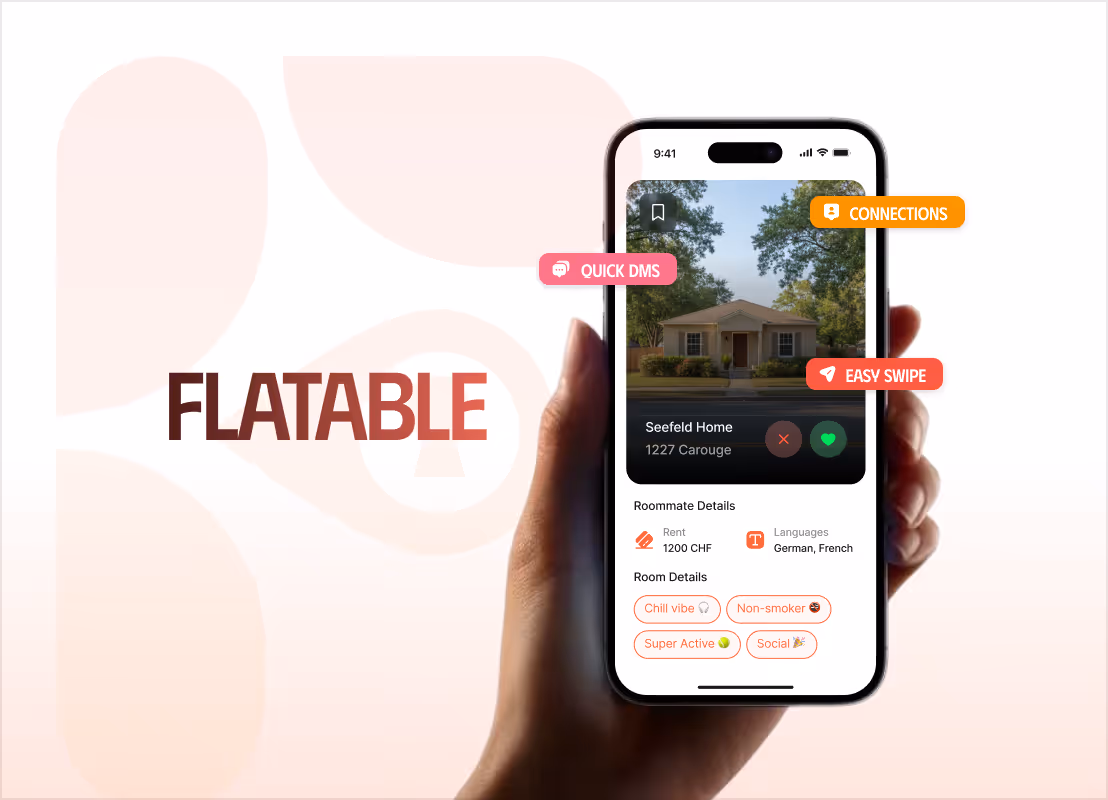

How We Made Flatable's Real Edge Impossible to Miss — at 95 on PageSpeed
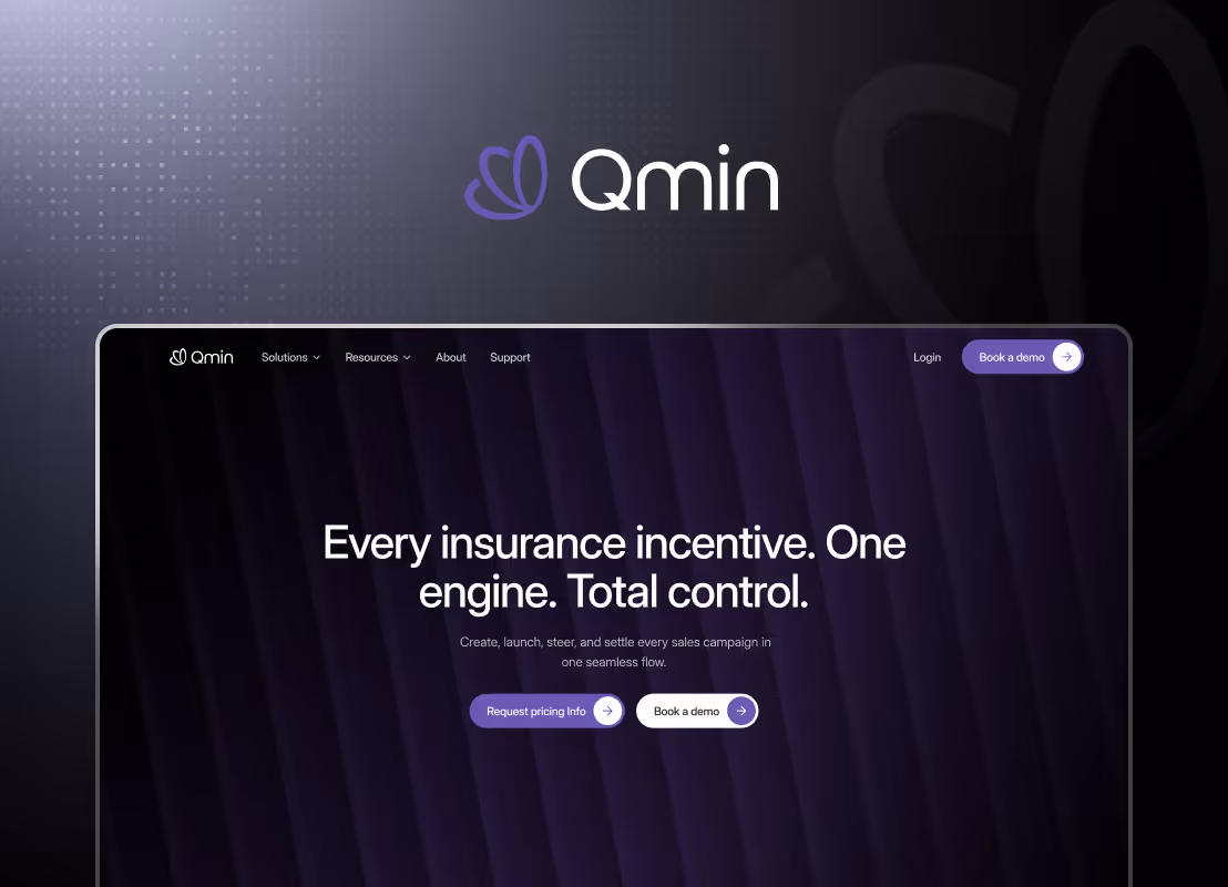
From a Dense, Complex Platform to a Product That Clicks in Under 60 Seconds
.avif)
A Premium Website Experience For a Flip Phone That Grew Sales by 50%
Increased session time from 20 Seconds to Over 3 Minutes: 3,600% More Engagement
From a One-Liner to a Full Brand: A Bold, Motion-Rich Site That Scored 97 on Lighthouse
From a Rough Document to a Revenue Channel Running on Zero Engineering Overhead

Tell us about your projectBook a freeconsultation
Trusted by the enterprise and growth teams
