
Deep Tech and Life Sciences
A component system so well-built, Amalia's non-technical team shipped 25 of 44 pages themselves.
Life sciences, simplified — but built without losing the depth underneath
Thras reached out about Amalia at the start of the year. We had originally reached out to Thras about a year ago, when we noticed their website wasn’t working as their strongest asset. It wasn’t a priority at that moment, but Thras remembered our conversation. The company is a life sciences consultancy out of Germany, working with pharma manufacturers on the parts of their world that don't show up on a marketing page easily — programme governance, GxP compliance, TraceLink implementations, and process analytical technologies. The first call was dense. Acronyms moved fast: GAMP 5, IQ/OQ/PQ, DSCSA, MAH, 3PL, CAPA. The kind of vocabulary that signals real expertise to a regulator and bounces off everyone else.
That was the project in one sentence: build a site that respects the depth, and still lets someone outside the industry get it on the first scroll. The bar from the start was enterprise — not Webflow Enterprise as a plan, but enterprise as a quality standard. The kind of site a regulated, pharma-adjacent buyer expects to land on.
Starting with structure, not visuals
Amalia had a brand book but no real website. Before any pixels moved, we sat down with Thras and shaped the information architecture: a homepage, a services landing, four service pillars each with their own landing and a set of sub-service pages, an Academy with the Requirements Training course as the high-priority entry, a careers section, a content layer for blog and About, and the utility pages a German company needs (Legal, Impressum, Thank You).
The strategic call here was about scale. Amalia wanted to add services and trainings over time without having to come back to us every time. We solved for that with a fully component-based Webflow build — no CMS shortcuts, no rigid template lock-ins, no "page builders" that fall apart the moment someone deviates. Every section on every page was built as a reusable component with editable slots, variants, and clear behaviour rules. Bullet items can be added or removed and the layout reflows; an empty slot hides itself; a new sub-service page is built by dropping the same components onto a fresh page and dragging copy in.
A lot of the craft on a build like this sits in one quiet decision repeated across hundreds of components: which slots stay open and which stay closed. Open where the client genuinely needs to vary content — copy, lists, eyebrows, icons, links. Closed where variation would only ever break the design — spacing rhythm, type scale, colour roles, container behaviour. Get that line wrong in either direction and the system either becomes a cage or starts drifting visually the first time someone outside the design team touches it. Get it right and the build survives every edge case of content addition you didn't plan for.
The huge win — Amalia building the site alongside us
The clearest proof that the foundation worked came midway through the project. While we were still actively building the rest of the site inside the Webflow Designer, Dr. Niki Sorogas and Antonios Michail — both non-technical members of the Amalia team — built around 25 sub-service pages themselves. No design support from us, no engineering hand-holding. They worked from inside Webflow's Marketer role, which means they couldn't touch the design layer at all. They could only assemble pages using the components we had already shipped.
That constraint was the point. It meant we didn't have to worry about the design drifting while we focused on the high-impact pages. They didn't have to wait on us to publish pages they had content ready for. The build moved on two tracks at once.
This is the part of the project we're proudest of, and the part that's hardest to convey in a portfolio screenshot. A non-technical team built around 60% of an enterprise-grade site themselves because the components had been thought through carefully enough to make that possible. That's not a Webflow thing on its own and it's not a Lumos thing on its own. It's what happens when you pick the right framework, build the foundations properly, and treat the choice between open and closed components as a design decision in its own right.
Finding the visual direction
Amalia's existing identity carried a flowing contour-line wave pattern that until then had only lived quietly in backgrounds and footers. We pulled it out. Used as the subject instead of the wallpaper, the waves gave the brand a register most consultancies don't have — organic, calm, distinctly not SaaS.
The next question was how to show the services. We didn't want stock illustration energy, and we didn't want anything that looked like a product screenshot when Amalia is in fact a services company. So we drafted three illustration directions and put them in front of Thras to react to:
- V1 — Simplified UI mockups. Clean stylized dashboards, one per service, communicating the outcome of working with Amalia.
- V2 — The same mockups, but with real pharma terminology on every label. A credibility play for domain buyers.
- V3 — Conceptual ecosystem compositions. Floating chips, fragments, recognition rather than detail.
We landed on a hybrid — recognition-first compositions on the homepage to keep the entry fast, deeper UI mockups in isometric conceptual illustrations on the pillar landings for buyers who needed to feel the depth. Every illustration sits inside a dark green/dark grey rounded container with white floating cards. That single decision tied the whole visual system together.
Motion across two layers — homepage and pillar landings
The hardest thing to say in words about Amalia was that their four service groups aren't four separate offerings. They're one integrated capability. That's the kind of idea text can't carry on its own, so we proposed motion at two layers.
On the homepage, we designed four wave-based animations — one per service pillar — running on short loops on viewport entry. All four share the same visual language: Amalia's existing flowing contour pattern, used as the subject of the animation rather than the wallpaper. Same grammar across all four. The set tells a single story without ever spelling it out: Amalia operates as a system.
Then on each of the four service pillar landing pages, we designed a second, separate animation — purpose-built for that page and the depth it had to carry. These are not the homepage loops repeated. They're their own pieces, made to do the heavier lifting once someone has clicked through and is actually evaluating the service.
The TraceLink piece
Halfway through the project, Thras came back from a TraceLink sales meeting with a bigger ambition for the TraceLink pillar landing. TraceLink was shifting from selling individual tools to selling their full agentic platform — a maturity arc that moves from compliance to autonomy. Amalia's positioning was that they guide clients through the entire journey, not just one product implementation.
We took it on as a scroll-triggered animation — one fixed isometric scene, the supply chain laid out left to right, and a sequence of transformations that each add a new layer to the same scene rather than replacing it. By the final frame, every layer is running simultaneously. One scene. Nothing leaves. Closing line — "From compliance to intelligence."
This was the most ambitious piece in the build, and the one we spent the longest iterating on. Production continued after launch, with a tight feedback loop with the Amalia team on every node, label, and beat.
The build
Development moved in parallel with design via the dual-track agile approach we use on tighter timelines — pages going into Webflow as they were signed off rather than waiting for full design completion. The whole front end was built on the component-based system described earlier, so the Amalia team could keep extending the site themselves long after we handed it over.
On the integrations side, we wired in Stripe Checkout for training payments, Iubenda for cookie consent and logging (including the GDPR-compliant privacy controls), Google Tag Manager, GA4, and reCAPTCHA on the contact form.
A note on craft. Our first typeface choice, Helvetica Neue rendered beautifully on Mac but inconsistently on Windows because of the differences in the font render engine of Windows and Mac. so we tested a fallback pairing before realising the right call was a different one: unify the experience across every device with a single typeface, and rebuild the styleguide around it. That was a significant shift mid-build, and the kind of change that on a less disciplined setup would mean days of cleanup. With Lumos and Webflow's variable-based styleguide, the swap propagated cleanly across every component on every page in one pass. The site stayed exactly as visually consistent on Windows as on Mac, with no compromise on either side.
Launch and what came after
The site went live on the agreed date — 27 April — and the response from the Amalia team that night was the moment we like best on any project. Thras: "Congratulations, everyone. Amazing work." From Niki on the Amalia side, who had carried QA all the way through: "#proudmoment."
The TraceLink animation, the GTM and Iubenda integrations, and a few smaller polish items continued in hypercare through May. We stayed close, which is what you do when an enterprise site has just gone live and the marketing team is still learning where everything sits.
What the site does for Amalia
The site reads like a serious consultancy. The four pillars are clear from the first scroll, and the motion lets a non-specialist understand the depth without being asked to read through twenty acronyms. Because the build is component-based end to end, the Amalia team can extend it themselves — new sub-services, new trainings, new job postings, new blog content — without coming back to us for structural work. And for buyers who need to see proof of expertise, the deeper pages carry that signal in the language and the detail.
For us, this project was about discipline. Holding the line on clarity in a domain where it's easy to overwhelm. Building a system that scales without flattening the story. And matching the seriousness of the company we were building it for.
.png)
%20(1).png)
%20(2).png)
.png)
%20(1).png)
.png)
%20(1).png)
%20(2).png)
.png)
%20(1).png)
.png)
.png)

How We Made Flatable's Real Edge Impossible to Miss — at 95 on PageSpeed
From a Dense, Complex Platform to a Product That Clicks in Under 60 Seconds
.avif)
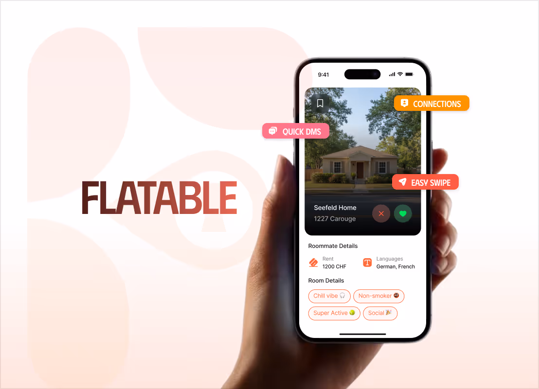
A Premium Website Experience For a Flip Phone That Grew Sales by 50%
Increased session time from 20 Seconds to Over 3 Minutes: 3,600% More Engagement

From a One-Liner to a Full Brand: A Bold, Motion-Rich Site That Scored 97 on Lighthouse
From a Rough Document to a Revenue Channel Running on Zero Engineering Overhead

Tell us about your projectBook a freeconsultation
Trusted by the enterprise and growth teams
