
.avif)

Software & Platforms
TwoDots — making the most important page in the site convert better
Before the first call with TwoDots, we spent some time on their website, trying to understand what the product actually did. We couldn’t.
The page looked like it had some art direction and clearly had a lot of effort behind it, but it didn’t explain the product in any meaningful way. There were strong visuals, a lot of personality, and very little clarity. It was hard to tell what TwoDots was, how it worked
That became clear on the call with Perry Finkelstein, GTM Partner at Two Dots.
TwoDots is a SaaS product. It helps property managers screen tenants using an AI-driven chat flow that verifies identity, detects fraud, and speeds up approvals. It’s a serious product, already being used in real workflows. The website, especially the Property Management page, wasn’t doing that product justice.
That page mattered the most. It was one of their key entry points and a major driver for demos. Perry was clear that this was where they wanted to start.
Where we focused
The goal wasn’t a full redesign or a brand overhaul. The ask was much simpler and more practical: make this one page work.
We looked closely at the existing information architecture and stripped it back. The problem wasn’t that there was too little content. It was that the content wasn’t organised in a way that helped someone understand the workflow quickly. Once the structure made sense, wireframes came together naturally.
The visual direction also needed a shift. The existing design system leaned heavily into character and playfulness, which worked against the kind of trust this page needed to build. We kept elements that already felt familiar, like navigation, but over the next few revisions we introduced a darker theme with blue accents and a cleaner layout to give the page more weight.
Showing the product, not talking about it
We added a single chat simulation animation to show how the screening process actually works. Nothing fancy. It was just enough motion to make the idea clear without asking users to read through long explanations.
That animation did one job: show the flow. Once people saw it, the rest of the page made sense.
Everything else on the page was designed to support that clarity. Tighter copy, clearer sections, and fewer distractions.
Building in an existing Webflow build.
The development challenge wasn’t complexity, it was restraint.
This page had to live inside an existing Webflow site without disrupting anything else. We introduced new components carefully, kept the build clean, and made sure performance stayed solid. The result fit naturally into the site while still feeling like a step forward.
After launch, we stayed involved for a short period, helping create a couple of additional landing pages using the same structure.
What changed
Once the new page went live, the difference was clear.
Bounce rate dropped by around 20 percent. Property managers spent more time on the page and came into calls with a better understanding of what TwoDots does. Sales conversations moved faster because the basics were already clear.
The page finally did its job.
Perry later shared that the new structure and animation made it much easier for their team to explain the product confidently.
For us, this project was about fixing something that wasn’t working and making the product understandable.
Since then, TwoDots has moved to a new visual direction across their entire website. The brand has evolved, and the current site reflects where the company is headed now.
.png)
%20(1).png)
%20(2).png)
%20(3).png)
%20(4).png)

A Redesign That Cut Bounce Rate by 20% and Animation Load Time by 70%
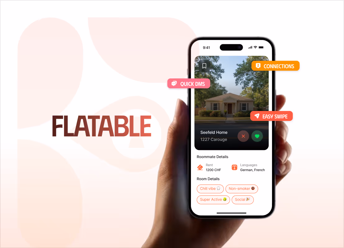
How We Made Flatable's Real Edge Impossible to Miss — at 95 on PageSpeed
From a Dense, Complex Platform to a Product That Clicks in Under 60 Seconds
.avif)
A Premium Website Experience For a Flip Phone That Grew Sales by 50%
Increased session time from 20 Seconds to Over 3 Minutes: 3,600% More Engagement
From a One-Liner to a Full Brand: A Bold, Motion-Rich Site That Scored 97 on Lighthouse

Tell us about your projectBook a freeconsultation
Trusted by the enterprise and growth teams
