
Scroll animations, 3D, GSAP everywhere, and a site that doesn't crawl. The two aren't enemies. Sloppiness is.
Most motion-heavy projects start with a version of the same sentence. "We want it to feel alive, cinematic, the phone should rotate as you scroll, big GSAP transitions, the works." And then, usually about a beat later, quieter: "but it still needs to be fast."
There's a belief baked into that pause. That you're asking for two things that fight each other, and you'll have to pick. A site that moves and feels expensive, or a site that loads and scores well. Pick one.
I want to take that false choice apart, because I've shipped enough of these to know it isn't real. A site full of animation can be fast. What kills performance isn't motion. It's motion built carelessly. The difference between the two is entirely discipline, and discipline is teachable. So here's how we actually do it.
First, why "just make it move" wrecks a site
When a site full of animation feels slow, it's almost never the idea. It's the execution underneath, and it's usually one of three things.
Everything loads at once, including the giant hero animation, before the visitor can see or do anything. Or the assets are simply too heavy, a 12MB animation file that looks identical to a 1MB one if you'd exported it right. Or motion got sprayed across every element on the page because it was fun to build, with no thought to cost.
None of those are the price of ambition. They're just things nobody stopped to handle. Which is the whole point: the fix isn't less motion, it's more deliberate motion.
The reframe: speed isn't the enemy of motion. Carelessness is.
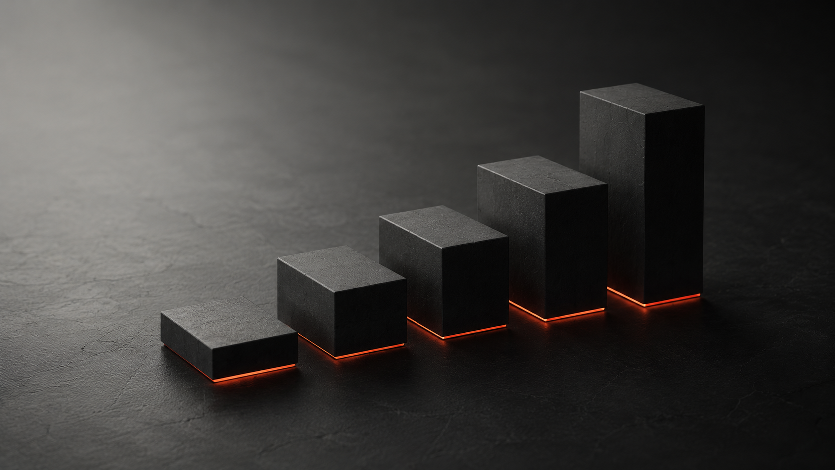
A fast motion-heavy site comes down to three questions, asked about every single animation on the page: what loads, when it loads, and how heavy it is.
Get disciplined about those three and you can ship something genuinely rich that still flies. Ignore them and even a "simple" site will feel like wading through treacle. Everything below is just those three questions, applied.
1. Pick the right tool for each piece of motion
Not all animation weighs the same, and matching the technique to the job is half the performance battle won before you've optimised anything.
A looping UI flourish, an icon that animates, an illustrated sequence: that's a job for Lottie or dotLottie, vector-based and tiny. Scroll-tied transitions, parallax, interactive cards, sequencing: GSAP, which is light and brutally efficient when used well. A product you need to rotate and explore in space: 3D or a scroll-driven render, the heaviest option, so you spend that weight knowingly and only where it earns its place.
On the Webless site, the product story needed roughly forty animated frames to explain how their AI search actually works. Exported as raw video or heavy JSON, that's a performance disaster. Built as lightweight Lottie and dotLottie, it's barely a rounding error. Same visual result, a fraction of the weight, entirely a function of choosing the right format up front.
2. Defer everything that isn't the first thing the user sees
The single biggest lever: don't make the visitor wait for animations they can't even see yet.
Your hero animation does not need to block the page from rendering. Neither does anything below the fold. The trick is to let the page paint and become usable first, then bring the motion in. On Webless, the hero animation loads only after the page has stabilised, and the scripts are deferred, specifically to keep LCP (the moment the main content appears) under control. The site looks rich. It measures fast. Those aren't in tension because the heavy stuff arrives a half-second after the part that matters, not before it.
This one change, loading order, is often the entire difference between a motion site that feels instant and one that feels broken, with the exact same animations on the page.
3. Be ruthless about where motion actually lives
Just because everything can move doesn't mean it should. The restraint is part of the craft, not a compromise to it.
When we built Your Culture, the brand genuinely demanded energy. Music labels don't want sterile. So the site leans hard into GSAP: powered transitions, interactive cards, horizontal scroll sections, parallax across pages. It moves because the brand moves. But our developers spent serious time being selective about where that motion lived and how it loaded. Not every element got an animation. The ones that did, earned it.
That site shipped with a Lighthouse performance score of 97, and perfect scores on accessibility, best practices, and SEO, while being one of the most motion-rich things we've built. To quote our own case study, because it's the whole lesson: that wasn't accidental. It was a choice. Restraint is what made the abundance possible.
4. Right-size your assets, especially for mobile
Heavy files are where good intentions go to die, and your phone is where you'll feel it first.
On Wonder Phone, we built scroll-based 3D sequences of the device rotating and flipping open as you move down the page. Beautiful, and exactly right for a premium piece of hardware. But some of the early animation files were heavier than we wanted, especially on mobile. So we refined the assets, adjusted how and when they loaded, and made deliberate trade-offs between file size and visual fidelity. The end result keeps the experience intact without feeling sluggish or fragile across devices, and sales went up over 50% after launch. A gorgeous 3D experience that tanks on a mid-range Android isn't a gorgeous experience. It's a liability with good lighting.
Compress aggressively. Test the actual file sizes, not how it looks on your machine. Assume the heaviest asset is the one deciding whether mobile users stay.
5. Build for the worst device in the room, not your machine
Here's the trap that catches almost everyone: you build and review on a fast laptop with fast internet, and everything feels great. Your users are on a three-year-old phone on hotel wifi.
The fast machine lies to you. It smooths over heavy files and inefficient animations that will stutter badly in the real world. So the real test for any motion-heavy build is a mid-tier phone on a throttled connection, because that's where the discipline either holds up or falls apart. If it's smooth there, it's smooth everywhere. If you only ever check it on your M-series Mac, you're shipping a site you've never actually seen the way most people will.
6. Make the motion mean something
This one's about taste, but it's also about performance, because the cheapest animation to load is the one you were right not to build.
Motion should help someone understand the product, guide their eye, or carry the feeling of the brand. On Wonder Phone, the phone opening calmly as the page loads tells you what the product is before you read a word. On Webless, the animations exist because generative search is abstract and a single sentence can't explain it. When motion has a job, every piece of it justifies its weight. When it's decoration sprayed on at the end, it's just cost with no return, and it's usually the first thing dragging your numbers down anyway.
Ask of every animation: what does this do? If the answer is "it looks cool," it had better look very cool, and it had better be light.
What I'd actually do, in order
If you're about to build something ambitious and you want it fast too:
- Decide what genuinely needs to move, and be honest. Cut the motion that's only there because you can.
- Match each piece to the lightest tool that does the job (Lottie/dotLottie, GSAP, 3D only where it earns it).
- Set the loading order deliberately. Page paints first, hero and below-the-fold motion arrive after.
- Defer your scripts so animation never blocks the main content from showing up.
- Compress every asset hard, and check real file sizes, with mobile as the priority.
- Test on a mid-tier phone on a slow connection. That's your real review device, not your laptop.
- Measure, then trim. Find the heaviest thing on the page and ask whether it's worth what it costs.
Notice none of that says "use less motion." It says be deliberate about it. You can have the cinematic, scroll-driven, alive-feeling site. You just can't have it by accident.
The honest bottom line
A rich, motion-heavy site that's also fast isn't a magic trick, and it isn't a trade-off you're stuck choosing between. It's the result of a hundred small, deliberate decisions about what loads, when, and how heavy, made by people who refused to treat speed and beauty as opposites.
That's the part worth internalising. When a stunning site also performs, it's almost never luck. It's discipline, applied quietly, everywhere. The motion is what people notice. The restraint underneath is why it works.
If you've got something ambitious in mind and you're worried it'll mean a slow, heavy site, that's exactly the kind of build we like. Happy to talk through what your idea would actually take to keep it both beautiful and fast.