
Deep Tech and Life Sciences
Lowr — finding the balance between playfulness and credibility
Lowr was one of our earlier projects, and it came to us in a very organic way.
The conversation with Chloe started on Linkedin, and the conversation started simply around a website that wasn’t working anymore.
Lowr is a sustainability startup focused on helping football fans and teams track travel-related emissions and reduce their carbon footprint. The mission was strong, the idea was though tful, and the brand had already been explored in depth. They had characters, illustrations, and a visual language that felt lively and optimistic.
The problem was execution.
Their existing site was built on Wix, and it had become a blocker. Updating content was painful, layouts broke easily, and the platform simply wasn’t flexible enough for where the company was headed. At the same time, fundraising conversations were starting. The website needed to be taken seriously by investors, without losing the personality that made the brand feel human.
Understanding what needed to change
On our early calls with Chloe, the ask was clear.
The brand guidelines already existed. The tone was set. What wasn’t working was how all of that showed up online.
The site leaned heavily into playfulness, which worked for storytelling, but didn’t carry enough weight in investor conversations. At the same time, stripping all of that away would have meant losing what made Lowr distinct in the first place.
The challenge was deciding what to keep, what to refine, and what to mature.
Designing with restraint, not replacement
We started with design, working closely with Chloe through weekly check-ins and async feedback. Illustrations and characters stayed, but they were used more deliberately. Visual hierarchy was clarified so the story could be understood quickly, without feeling childish or chaotic.
We also redesigned the product mockups. The earlier visuals didn’t do the app justice, so we rebuilt them to better reflect how the platform actually works and to give the site more credibility when explaining the product.
Once the design direction felt right, we moved the entire site to Webflow.
Moving from Wix to a system that could scale
The Webflow build focused on structure and longevity. We implemented a clean, scalable framework that made it easier for the team to update content, add pages, and evolve the site as the company grew.
Animations were kept subtle. Nothing flashy. Just enough movement to keep the site feeling alive without distracting from the message. Compared to the old Wix setup, the difference in flexibility and performance was immediate.
What the site enabled next
After launch, the website finally felt aligned with where Lowr was going.
It became a reliable asset in investor conversations. The product story was clearer. Over time, Lowr went on to close successful funding rounds, and while a website never does that alone, this one started supporting the narrative they were telling.
This project was about learning how to work within an existing brand and still move it forward. Sometimes that’s exactly what a young company needs.

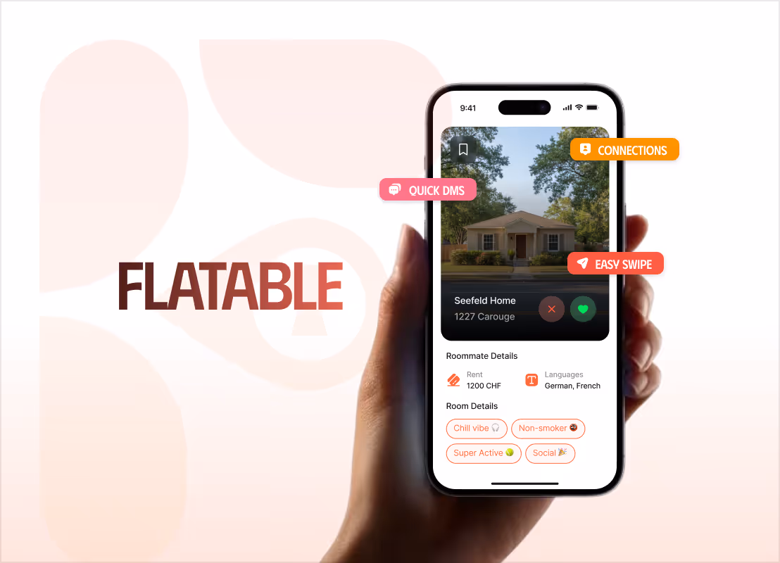
A Redesign That Cut Bounce Rate by 20% and Animation Load Time by 70%
How We Made Flatable's Real Edge Impossible to Miss — at 95 on PageSpeed
From a Dense, Complex Platform to a Product That Clicks in Under 60 Seconds
.avif)
A Premium Website Experience For a Flip Phone That Grew Sales by 50%
Increased session time from 20 Seconds to Over 3 Minutes: 3,600% More Engagement
From a One-Liner to a Full Brand: A Bold, Motion-Rich Site That Scored 97 on Lighthouse

Tell us about your projectBook a freeconsultation
Trusted by the enterprise and growth teams
